Top 10 A/B tests maximise your product page performance
What are A/B tests?
In an A/B tests you have two designs of a website; A and B, where A is the original page and B is the new design. The traffic is split between the two versions and we measure how many does the desired action (buy a product, sign up for a newsletter etc.), what we call a "conversion". After the test periode the version with the highest conversion rate is the one who wins, and we might test the winning page against a new design C, and so on.
There is no rule for how long time a test should be running. It all depends on the traffic and the traffic variations. You might have a lot of traffic to the site during the week and low during the weekends. However, it is important to achieve significance, e.g. A is better than B, or B is better than A.
Example:
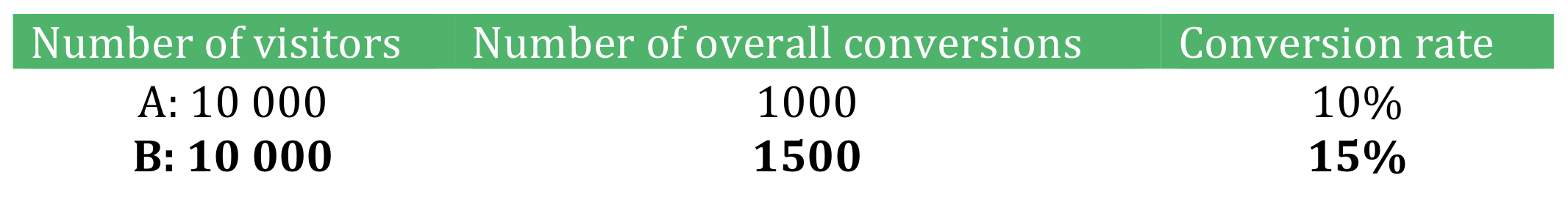
Test B converted 50% better than test A, and we are 100% certain that the changes in test B will improve our conversion rate. (You can find different Significance calculators online such as https://www.easycalculation.com/statistics/statistical-significance.php
With A/B tests we are moving from ”we think” or ”we feel” to ”we know” letting you work more effectively with increasing the conversion rate of your ecommerce website.
The top 10 A/B tests on your product page
The best place to start A/B testing is the product page since this is the page where the customer decides to buy or not, and it is the first step of the check out process.
Based on my experience with running over 100 A/B tests on large ecommerce sites like Zalando and Nelly.com, these are the top 10 tests that will have the most effect on your conversion rate.
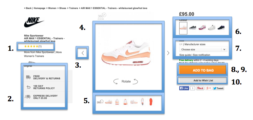
1. Customer product rating
Customer ratings builds trust, and they are more likely to trust the review of another customer over the description provided by the vendor. But did you know that how the rating is displayed also effects conversions? I recommend you test different symbols, placements of the rating and its colour.
2. Delivery information
By showing the delivery information through the whole shopping process you can increase the conversion rate. If you have this information only on one particular page, customer might leave the product page to read about the delivery information and be distracted before she has added the product into the shopping bag.
3. Arrows vs thumbnails
When you have multiple product pictures try testing moving between the pictures using arrows versus thumbnails under the picture, or (usually) the best option: have both.
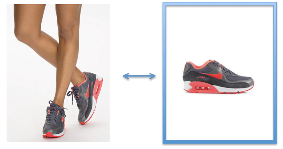
4. Product pictures
Product pictures has a big effect on conversion rate, but you should you use imagery of only the product, or the products worn by a model? In my experience there is no general rule for what converts best, and it might even vary between product categories. So test, test, test.
5. Product views
Here you could test if customers do prefer 360 degrees rotation views, pictures or video presentations. Again there is no general rule for what converts best, and you need to test what works best for you.
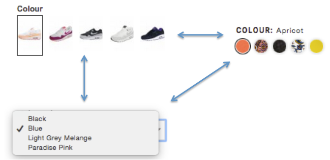
6. Colour filters
Test different variation of colour filters to see what your customer find easier to work with. Is it using product examples or classic colour boxes? Remember, what works for one site, might not be as effective on yours, and vice versa.
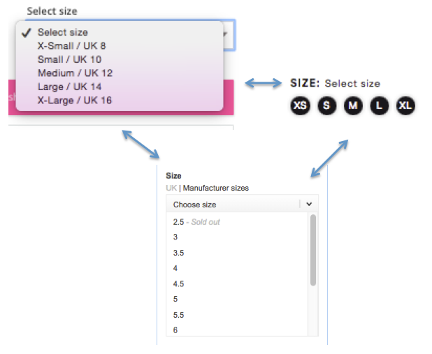
7. Size filters
You can do different types of test of the sizes such as: the design of the buttons (colour, size, text, icons), should you use a size guide (e.g. European size and manufactured sizes) and size notifications.
8., 9. Add to bag
Test the size of the button and the colour (I have good experience with yellow and orange).
Another easy way you can increase the conversion is to test the wording of the shopping bag button. For example, add to bag, add to shopping bag, buy now, and so on. Changing the wording of a button, may cause tremendous effect on conversion
10 Add to wishlist
Sometimes we do have a wish list, but our customers do not know how to use it. Measure the use of the wish list and optimize the design.
Need help with A/B testing?
Feel free to contact me if you need help setting up your own A/B tests, or otherwise increase your conversion rate.
About Adela
Adela is an ecommerce analyst at Geta with international experience from ecommerce sites like Zalando and Nelly.com. At Geta Adela guides Norwegian and international ecommerce sites to success by helping them set up a clear ecommerce strategy, marketing plan, correct merchandizing and conversion rate optimalization.
Contact Adela today to hear how she and Geta can make your ecommerce site a success.