Your checkout is not an escape room
"Your customers should not have to solve a puzzle to buy your products."
The Starting Point
Skeidar is a leading Norwegian furniture retailer selling both online and in physical stores. We are proud that they have chosen to use Geta to help build their online store. Together we have explored customer pain points and worked on creating improvements by drilling down on areas we know need focus.
This post is about how and why we worked on improving delivery options and what the results were.
The Problem
Skeidar’s delivery options were increasing faster than the ability to present them to customers. Every time we added a new option, the choices became more complicated, and customers were bewildered by the many combinations available.
Not only is the logistics of moving large, heavy items more costly and more complicated than for example delivering clothes, but unnecessary mistakes excessively erode margins. Many of the products are custom-made which involves long lead-times and drop shipments, creating further complication of the presentation of information.
Boka in ett möte i kalendern
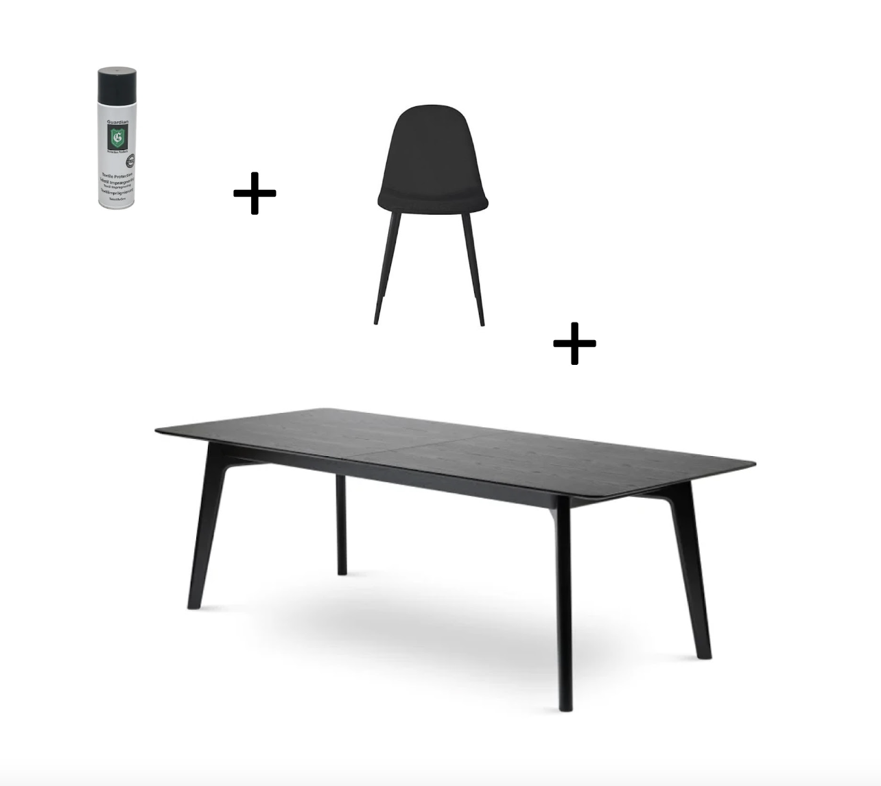
The combination of small and large products, such as pillows and beds, also meant that customers often deleted the smaller products in the checkout because of the array of choices.
Gamification is sometimes described creating friction in the right places, but when we started joking that the checkout felt like an Escape room we knew the saturation point had been reached.
The Process
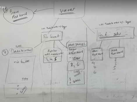
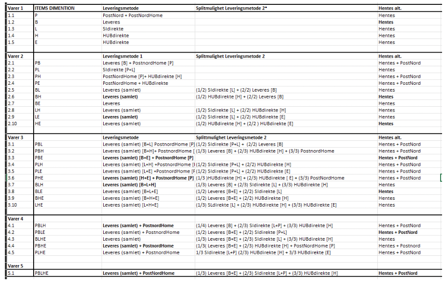
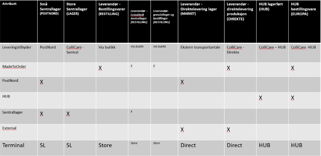
After a workshop session where we identified the key information needed at each stage of the delivery process, we created a table with the properties needed on each product.
These had to be made in a way that would give us the flexibility to present the combinations in a way that did not restrict delivery methods when more products were added to the cart. We wanted to maintain the functionality of easily toggling between online delivery and click & collect so an additional layer of complexity was added here.
The whole aim was to show the most effective delivery method for the combination of items the customer had chosen but at the same time making it very dynamic and easy to understand.
After the information was structured, Geta’s UX designer got to work in Figma sketching how this could look in the checkout. What seemed reasonably simple to do proved that achieving consistency across all options was not as easy as it seemed.
Egos were put on hold and there were a number of attempts made before everyone agreed we had a good starting point. Being willing to start from scratch when a solution turns out to be a dead-end requires trust and openness, and qualities such as these are important for teamwork.
Once the design was in place, the tech team then went into isolation and created algorithms that made it possible to present the correct choices at relevant points in the customer journey.
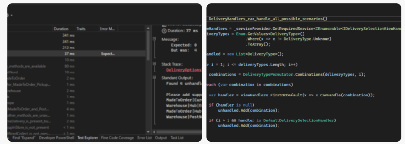
To avoid situations where there were unhandled combinations of deliveries could occur, we put together a verification system that:
- Calculates all possible delivery types
- Check that they exist as options
- Provide a list of delivery methods we haven’t counted on existing so that we can decide what to do with them.
The screenshots below are examples from the code.
The simplification process of choices involved removing complexity on the product page and checkout before it actually became necessary. This strategy was preferable to trying to explain the available choices, which could have been another way of solving the problem.
Skeidar also decided to not support some edge-case combinations that would make the solution less robust. “Killing darlings” is often a difficult choice to make, but making it easier for the majority of customers should be the main aim. The verification system the developer had built made it possible to make this choice in an informed way and not by accident.
Another success factor was that the e-commerce manager at Skeidar was very clear in his communication about how he expected the other departments to contribute. The succinct grouping and description of the choices made it easier for other departments at Skeidar to identify how they could contribute to simplifying the process of delivery.
The results
Skeidar are extremely pleased with the results of the restructuring.
Before the changes, smaller interior products, such as cushions, had been difficult to sell in combination with large products like sofas. After the changes sales increased by 61% for the smallest products and 78% for the Interior category as a whole. Larger furniture sales increased by around 56%.
In garden furniture, the new check-out and delivery options made it clearer that there was a much faster delivery time than had been available before - the result was an extreme 139% increase in sales.
In addition, adding new freight methods has become easier. When Skeidar wanted to add 2 more shipping methods a few months later (with now over 30 possible combinations) the algorithm was so robust it was reasonably quick to do so.
Boka in ett möte i kalendern
The take-aways
The take-aways are maybe a repetition of points we already know but need reminding of on a regular basis:
- Prepare: Time used on thorough specification and UX prototyping reduces errors later in development.
- Open up: Create an environment that enables trust and experimentation so the team doesn't get stuck defending bad solutions.
- Prioritise: Simplify the journey taken by the majority of customers and prioritise removing the biggest pain points.
- Solve problems: Gamification should be intentional and your checkout is not an Escape Room.
- Explain: Invest time helping your organisation to help you, and don’t assume they understand the issues customers are experiencing with online sales.
- Choose a development platform that allows you to be creative and flexible in your architecture, such as Skeidar have done with Optimizely.
You can read more about the work we are doing for Skeidar here.
We also wrote a blogpost on user testing for Skeidar, check it out.
Boka in ett möte i kalendern
Kontakta oss

